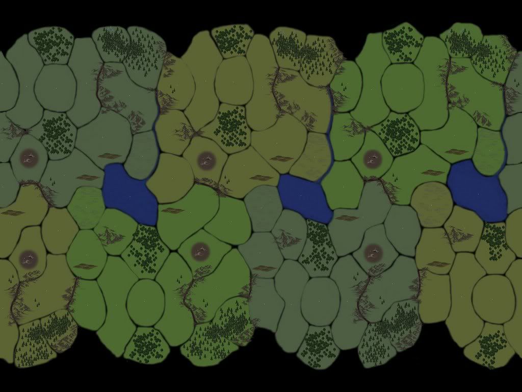
This is my first non-random map. I fixed the east-west edges after flattening, then discovered the original palette was extra-ugly in Dom3, mostly because of hard-to-read province names. So I just darkened the whole thing.
Anyway, it's 6 players, with only six valid starting locations, none of which are water. Each player starts in similar geography, and the map scrolls East-West for additional balance.
Please give me suggestions for improvements!
I'm working on a new version to:
- Get the white province dots off horizontal alignment, to make the names more readable.
- Use a different icon for Waste terrain.
- Ditch the 'blueish-green' color, since in wraparound there's a noticeable tint change in the wrapped tiles.
- Make the borders cleaner.
- Add a few in-province rivers, so some provinces can have a 'Fresh Water' attribute.
- Add an icon to the 'Large' provinces.


