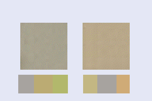
You can see some of the colour variations for the Shermans
HERE
Some are more grey, some more green, some more tan but all are variations on tan/grey or green/grey OR tan/green/grey and you can see variations just in two photos of the M51
This is more or less the choice

converted to game palette they look this but at that scale, it does not look much different than the first examples that are solid colours

enlarged shows what the palette breaks those colours down to..

so to "
trompe l'oeil" ( fool the eye) using the game palette each of the colours that the original breaks down to needs to be sprinkled onto the Icon which is what was done in the previous examples and they can be more grey or green or tan depending on the proportion for colour sprinkled on.
There are less than 200 colours in the game palette than can be used on an Icon like this so to get subtle variations in colour an Icon builder needs to be "creative" but it DOES stretch the palette quite a bit. When I paint Icons like that I generally use 33% set for both the density and Opacity of the " sprinkling" ( in case anyone wants to give this a try on their own icons.) and then the result has to have the game palette applied and the effect can change depending on if Nearest colour matching or error diffusing dithering is used to apply the palette...sometimes I try both methods then pick the one I like best. What really helps make this work is that shades of grey have the largest representation in the game palette and the human eye does not easily pick out individual pixel differences but tends to blend them together
Just FYI


